2 Exploratory data analysis (EDA)
2.1 Plan the Study
2.2 After collecting the data
2.3 What is EDA?
Exploratory data analysis (EDA) was first formally introduced by Tukey (1977) in his influential book, Exploratory Data Analysis.
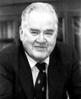
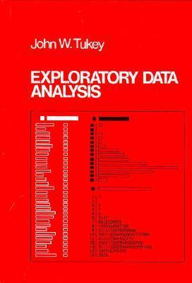
Since then, its importance has grown significantly, especially in recent years, for several key reasons (Midway 2022):
i) data is being produced faster and in larger volumes than ever before,
ii) modern computing and software tools make it easier to explore, clean, and visualize data in meaningful ways,
iii) contemporary statistical models are often complex and assumption-dependent, requiring us to thoroughly understand the data before applying formal techniques.
The EDA may not be fully described in concrete terms, but most data analysts and statisticians know it when they see it.
Important
The EDA is important because it helps researchers make thoughtful decisions about which ideas are worth exploring. Sometimes, the data clearly show that a particular question does not have enough support to be studied further—at least not with the current evidence.
The main goals of EDA are:
To suggest hypotheses about what might be causing the patterns or relationships observed in the data,
To guide the choice of appropriate statistical tools or models by helping you understand the structure of the data,
To assess key assumptions that must be checked before applying formal statistical analysis (e.g., linearity, normality, independence),
To provide a basis for further data collection, by highlighting gaps, inconsistencies, or areas where more information is needed.
Note
EDA is not typically the final stage of analysis. Rather, it serves as a transitional step between raw data and formal modeling. The insights gained through EDA guide decisions about which models to use, which variables to consider, and which data issues to address.
ImportantEDA Checklist
Roger D. Peng in his book (Peng 2012) provide this checklist for conducting EDA.
Start with a clear question: Before you begin EDA, take time to define exactly what you want to find out. A clear question or hypothesis gives your analysis purpose and helps you stay focused along the way.
Load your data carefully: Make sure your dataset is fully and correctly loaded into your analysis tool (e.g., R or Python). This first step is essential—it sets the stage for everything you will do next.
Take a first look at the data: Check that the file type, structure, and layout are what you expected. Make sure everything is organized in a way that works for your analysis.
Use
str()to Peek Inside the Dataset: In R, it will get a quick summary: number of observations (rows), number and names of variables (columns), variable types (e.g., numeric, character, factor), and a preview of the data valuesLook at the Beginning and End of Your Data: Use functions such as
head()andtail()to view the first and last few rows. This visual check can help to detect issues such as incorrect headers, blank rows, or unusual formatting.Check the Number of Rows (“\(n\)“): Make sure to verify how many observations (rows) are in your dataset. Compare this to what you expected from the original. source. If the number is too high or too low, there may be missing values, duplicate entries, or extra rows (e.g. duplicates or blank lines).
Validate with an External Source: When possible, compare part of your dataset with a trusted external source, such as official statistics or published reports. This helps confirm the accuracy and reliability of your data.
Try the Simple Solution First: Start by basic methods–such as summaries, tables, or visualizations– to explore and answer your question. Simple tools can often reveal key patterns or issues. Use more complex techniques only of necessary.
Challenge Your Findings: Once you find a result, pause and ask yourself: Does this make sense? Check your assumptions and consider possible errors or missing information. Being critical helps make your results stronger and more trustworthy.
Decide What to Do Next: Use the insights from your EDA to guide your next steps. You may decide to collect more data, use new methods, or refine your question. Sometimes , your initial findings are already enough to answer your main question.
In Chapter 4 of Midway (2022), interested reader can find some comments for each step.
Important
EDA is the single most important task to conduct at the beginning of every data science project.
Tip
EDA is like exploring a new place – you do not know what you will find until you start looking.
2.4 Enter the world of EDA
Now it is time to start working with data directly. To do that, we must first understand how data are structured and what types of variables we are dealing with.
Most datasets are organized in a rectangular format — like a spreadsheet — where each row represents one observation (e.g. a person, object, or experiment), and each column represents a variable (e.g. name, age, group, result).
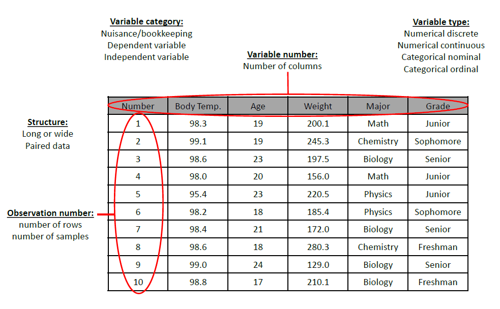
As an example, let us explore the mpg dataset with a few simple commands in R:
2.4.1 Types of Variables
Variables represent the information we collect in data analysis. They can be broadly divided into categorical and numeric types.
2.4.1.1 Categorical Variables
Categorical variables describe qualities or characteristics. They answer questions like “what type?” or “which group?”.
Also called qualitative variables, and they produce qualitative data.
They do not have numeric meaning (even if represented by numbers)
They fall into two main groups:
Nominal Variables
Categories have no logical order.
They are simply labels or names.
For example, Gender (male, female), Blood group (A, B, AB, O), City (Lisbon, Porto, Faro, … ), color (red, blue, green), the types of drinks at Starbucks, a person’s eye color.
Ordinal Variables
Categories can be ordered or ranked.
However, the distance between categories is not exact or consistent
For example, Satisfaction (low, medium, high), education (primary, secondary, university), rank (1st, 2nd, 3rd), Academic grades (A, B, C)
Note
Avoid coding categories with numbers (e.g., Male = 1, Female = 2), as this may wrongly suggest order or allow meaningless calculations.
Tip: Use clear text labels like "Male" and "Female".
In R, categorical variables are usually stored as factors. But sometimes they might appear as character or even numeric, especially if the dataset is not clean or comes from an external file.
You can check whether a variable is a factor using:
To see the possible categories (called levels) of a factor, use:
If a variable is not a factor but should be treated as one, you can convert it like this:
Tip
Sometimes, datasets are not ready for analysis and categorical variables may be incorrectly coded as numeric or character. Always check and convert them to factor if needed before analysis or plotting.
You can use the following commands to help:
is.factor(mpg$class)
levels(mpg$class)
mpg$class <- factor(mpg$class)The mpg dataset contains information about different car models, including manufacturer, engine size, fuel efficiency, and more.
Your task is to:
- List all the categorical variables in the dataset.
- Use
is.factor()to check which variables are already treated as factors (categorical). - If a variable is not a factor but should be (e.g.,
classortrans), convert it usingfactor(). - Use
levels()to inspect the categories. - Finally, fill in the table to classify each categorical variable as nominal or ordinal.
Fill Table to Complete
| Variable | Is it categorical? (Yes/No) | Scale (Nominal / Ordinal) | Justify your answer |
|---|---|---|---|
manufacturer |
|||
model |
|||
trans |
|||
drv |
|||
fl |
|||
class |
|||
year |
|||
displ |
Use `str(mpg)` to inspect all variable types.
Use `is.factor()` to check factor status.
Use `levels()` to explore categories.
Variables like `class` and `fl` are good candidates for factors.
Nominal= unordered categories; Ordinal= categories with a meaningful order.
Do it yourself :)
2.4.1.2 Numerical variables
Numeric variables describe quantities that can be measured. They answer questions like “how many?” or “how much?”.
Also called quantitative variables, and they produce quantitative data.
They are numbers we can measure, and we can meaningfully perform mathematical operations on them.
Usually, they have a measurement unit.
Numerical (quantitative) variables can be classified in two complementary ways:
Continuous vs. Discrete – How values occur
Ratio vs. Interval – How the scale is defined
Continuous vs. Discrete
Continuous Variables
Can take any value on a number line, including decimals.
Represent real-world quantities.
They may be restricted to positivevalues (e.g., mass) or include negatives (e.g., temperature changes).
Some examples are: mass, age, temperature, time.
Discrete Variables
Take only whole number values (no decimals).
Based on counting.
Cannot take values between integers (e.g., 2.5 students does not make sense).
Some examples are: number of students, number of offspring, number of infected individuals
Ratio vs. Interval
Numerical variables can also be distinguished by the scale of measurement, which affects how we interpret differences, proportions, and ratios.
Ratio Variables
Have a true zero point (zero means “none”).
Allows all mathematical operations, including ratios and proportions.
Interpretation: “Tree A is twice as tall as Tree B.”
Some examples are: Height, Weight, Age, Income, mass.
Interval Variables
Do not have a true zero (zero is arbitrary).
Allows meaningful differences, but not ratios.
Interpretation: “The difference between 20 °C and 10 °C is 10 degrees,” but not “20 °C is twice as hot as 10 °C.”
Some examples are Temperature (in Celsius of Fahrenheit), IQ scores, Calendar dates (e.g. year 1000 vs. 2000)
Note
Same Quantity, Different Scales
The distinction between ratio and interval depends on how the variable is measured, not on what is being measured.
For example,
Temperature in Celsius → interval scale (arbitrary zero).
Temperature in Kelvin → ratio scale (absolute zero).
So, the same phenomenon (temperature) can be an interval variable (in °C), or a ratio variable (in K).
Tip
Variable Types Are Not Always Fixed
You cannot determine a variable’s type just from its name — it depends on how the data is recorded.
Example: Age
If recorded as an exact value (e.g., 25, 35.5, 80), it is a numerical variable.
If recorded in categories (e.g., <20, 21–25, 80+), it is a categorical variable.
In R, numeric variables include both:
- Integers (whole numbers, like 1, 2, 3), and
- Doubles or floats (decimal values, like 3.14, 5.0)
You can check a variable’s numeric type using:
In R, most numeric data are stored as double even if they look like integers.
You can convert to numeric explicitly if needed:
The mpg dataset includes several numeric variables related to fuel economy and engine size.
Your task is to:
- Identify the numeric variables in the dataset using
is.numeric(). - Check if the numeric variable is an integer (
is.integer()) or a float (is.double()). - Complete the table and classify each variable as:
- Discrete (countable values)
- Continuous (can take any value within a range)
- Comment on any variables that could be treated as categorical instead, depending on context.
- Use
str(mpg)andsummary(mpg)to explore data. - Use
is.numeric()to detect numeric variables. - Use
is.integer()andis.double()to check type. - Discrete = exact counts; Continuous = measured values
Do it yourself :)
Summary of Variable Types
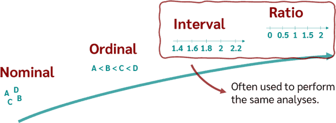
| Variable Type | Scale | Ordered? | Can Measure Distance? | Can Divide? | Examples |
|---|---|---|---|---|---|
| Nominal | Categorical | ❌ No | ❌ No | ❌ No | Gender, City, Color |
| Ordinal | Categorical | ✅ Yes | ❌ No (not exact) | ❌ No | Rank, Education, Likert |
| Interval | Numeric | ✅ Yes | ✅ Yes | ❌ No | Temperature, Year |
| Ratio | Numeric | ✅ Yes | ✅ Yes | ✅ Yes | Age, Weight, Income |
Tip
If you are not sure about a variable, ask:
- Does the variable have a natural order?
- Can we count it or measure it?
- Does it have a true zero?
Important
Knowing the types of data matters because:
Different statistical methods apply to different variable types.
Some graphs and visualizations only make sense for some types of variables.
2.4.2 Types of EDA
EDA helps us answer important questions like:
- What are the most common values of a variable?
- How much do observations differ from each other?
- Is one variable related to another?
To answer these questions, EDA is generally cross-classified into two ways:
| Non-graphical (numbers/tables) | Graphical (plots) | |
|---|---|---|
| Univariate (one) | Univariate × Non-graphical | Univariate × Graphical |
| Multivariate (≥2*) | Multivariate × Non-graphical | Multivariate × Graphical |
* Often bivariate.
In EDA, non-graphical methods are simply the numbers—the collection of descriptive statistics that summarize data (center, spread, shape, position, and association), while graphical methods are the visual counterparts that show those same properties (e.g., histograms/boxplots for distribution, scatterplots for association), helping us verify, compare, and spot patterns or anomalies that the numbers alone might hide.
Univariate methods examine a single variable at a time, whereas multivariate methods consider two or more variables to explore relationships—most often bivariate, though sometimes three or more—and it is generally best practice to first perform univariate EDA on each variable before moving on to multivariate analysis.
Beyond the four cells of the cross-classification, EDA choices also depend on each variable’s role (outcome vs explanatory) and type (categorical vs quantitative)—and there is an element of art that grows with practice.

2.4.2.1 Descriptive Statistics
Note
When we measure the same characteristic (e.g., age, gender, task speed, response to a stimulus) on all subjects in a sample, the resulting values form the sample distribution of that variable. This sample distribution is our imperfect window onto the population distribution.
Descriptive statistics aims to describe the sample distribution—its location, spread, shape, and unusual observations—and to make tentative statements about which population distributions could plausibly have generated it.
Descriptive statistics give numerical summaries of a dataset.
Before diving into categorical and numerical summaries, first check for missing values. Missingness is part of the data story and can be informative: count missing values and look for patterns (are they concentrated in certain variables or groups?). In EDA, always report the number (and share) of missing values per variable. We will return to strategies for handling missingness later, since it merits more attention and advanced methods.
TipR Tip:
any(), all(), and anyNA()
any(x)returnsTRUEif at least one value inxisTRUE.all(x)returnsTRUEonly if every value inxisTRUE.anyNA(x)is a shortcut to check if any value isNA(missing) in a vector or data frame.
Examples
x <- c(1, 2, 3, NA)

any(is.na(x))     # TRUE – there is at least one NA
all(is.na(x))     # FALSE – not all are NA
anyNA(x)          # TRUE – a fast way to check for NA,
Use any() when you care if a problem exists, and all() when you want to know if everything passes a check.
Note
summaries like mean/SD ignore NA by default only if you set na.rm = TRUE; silently dropping cases can bias results.
Univariate Case
- Qualitative Data
For a categorical variable, the key features are the set of categories (the possible values) and how often each occurs (frequency or relative frequency).
The primary tool is a frequency table: list each category with its count and proportion/percent. Always include the total \(N\) (and any missing) to verify that every recruited subject is represented. As a quick quality check, proportions should sum to \(1.00\) (or \(100\%\)). Once you are comfortable, reporting either proportion or percent is sufficient—they are equivalent.
- Quantitative Data
A quantitative variable’s population distribution is described by its center (typical value), spread (how much values vary), modality (how many peaks), shape (including how long or heavy the tails are), and outliers (unusual values). The data we observe are just one random sample among many we could have drawn, so the sample’s features matter only because they help us learn about the population they come from.
What we observe for a given variable is the sample distribution—how the values happen to fall in this particular sample. If we drew another sample from the same population, the distribution (and the numbers we compute) would likely be different because of random sampling (and, in experiments, possibly different treatment assignments or conditions). From each sample we can calculate sample statistics—mean, variance/standard deviation, skewness, kurtosis—but these vary from sample to sample, so they are not exact truths; they are noisy estimates that provide uncertain information about the population distribution and its parameters.
If a quantitative variable has only a few distinct values, a simple frequency table (as with categorical data) can be a useful tool. More often, though, we rely on numerical summaries—sample statistics like the mean, median, variance, standard deviation, skewness, and kurtosis. These are best understood as estimates of their corresponding population parameters. We aim to learn what we can about those parameters from a random sample, knowing we can’t know them exactly, because the parameters are “secrets of nature.”
Note
Quantitative vs categorical summaries
For quantitative variables, it is meaningful to report a variable’s central tendency (mean/median), spread (SD/IQR), skewness, and kurtosis. For categorical variables, these summaries do not make sense—use counts, proportions/percentages, number of levels, mode, and missingness instead.
They describe the key features of a variable:
Center (e.g., mean or median) — a typical value
Spread (e.g., standard deviation or interquartile range) — how much values vary
Shape (e.g., skewness) — symmetry or lean and tail behavior
Extremes (e.g., minimum, maximum, or outliers) — unusual low/high values
Central Tendency
A measure of central tendency tells us what a “typical” or “middle” value looks like in the data.
The most common measures are the (arithmetic) mean, the median, and sometimes the mode.
Caution
In special situations you may also see geometric, harmonic, trimmed, or Winsorized means used as measures of centrality.
Note
Most authors use average to mean the arithmetic mean, though some use average more broadly to include these other means.
If we have \(n\) values \(x_1\), \(x_2\), \(\ldots\), \(x_n\), the sample (arithmetic) mean is
\[ \bar{x} = \frac{1}{n} \sum_{i=1}^n x_i \]
In words: add up all the values and divide by the number of values.
Tip
A helpful picture is the fair-share idea—put everything into one pot and split it equally; the amount each person would get is the mean.
For most descriptive quantities, there is a population version and a sample version. In a fixed finite population—or in an idealized infinite population defined by a probability model—there is a single population mean, a fixed (often unknown) parameter. By contrast, the sample mean changes from one sample to another; it is a random variable. The distribution of the sample mean over all possible samples is its sampling distribution. This reflects the idea that, at least in principle, we could repeat the sampling many times and recompute the statistic each time, getting different values. Under suitable assumptions, probability theory lets us derive the exact (or approximate) form of this sampling distribution.
Warning
The mean is sensitive to outliers
Be careful: the mean can be pulled toward extreme values. For example, using the mean to describe income is often misleading because a few very high earners raise the average.
What to do instead: for skewed data, report the median (and IQR) or show both mean and median; consider trimmed/Winsorized means; always add a quick plot (histogram/boxplot).
The median is another measure of central tendency. To find it, first sort the \(n\) values from smallest to largest. If \(n\) is odd, the median is the middle value; if \(n\) is even, it is the average of the two middle values. When there are ties around the middle, statistical software applies standard rules so you still get a single number. (For some discrete variables there may not be a unique theoretical median, but software returns a conventional choice.)
In the 2004 U.S. Census Bureau Economic Survey, the median family income was $43,318, meaning half of families earned less and half earned more. The mean (average) was $60,828, the amount each family would have if total income were split equally. The gap between these two numbers is large because a few very high incomes pull the mean upward.
Tip
Robustness of the median
The median is robust, a few very large or very small values usually do not change it. You can move the highest or lowest observations far away and, as long as the middle order does not change, the median stays the same.
The mode is the most frequent value. For quantitative data it is rarely a good “typical” summary because with continuous or rounded variables the result depends on binning/rounding, may be non-unique, and many samples have no repeated value. We mostly use mode as shape language—unimodal (one peak), bimodal (two), multimodal (many). In practice, it is conceptually useful but hard to estimate robustly for numeric variables, and is used more for categorical or discrete data.
Note
Mean vs. median
The most common measure of central tendency is the mean. When outliers are a concern, the median may be preferred.
Spread (Dispersion)
Spread tells us how far values tend to lie from the center and how different they are from one another. A dataset with very similar values has low dispersion; one with values scattered widely has high dispersion. Three common measures:
- Variance — the average squared distance from the mean. Useful mathematically, but harder to interpret because it is in squared units.
- Standard deviation (SD) — the square root of the variance. Same units as the data; think of it as a typical distance from the mean. For bell-shaped data, most observations sit within a few SDs of the mean.
- Interquartile range (IQR) — the distance between the 25th and 75th percentiles; the middle 50% of the data. Robust to outliers, and usually paired with the median.
Other quick checks: the range (max − min) is easy but very sensitive to extremes; MAD (median absolute deviation) is a robust alternative to SD.
The MAD can be defined as
\[ \mathrm{MAD} = \mathop{\mathrm{median}}_{1\leq i \leq n} |x_i - \bar{x}| \]
Tip
Which measure when?
Use SD when the distribution is roughly symmetric and free of extreme outliers. Use IQR (often with the median) when the distribution is skewed or contains outliers.
Warning
Outliers inflate variance/SD.
A few extreme values can make the variance and SD look large even if most data are tightly clustered. Always check a plot and consider IQR/MAD for robustness.
To describe spread, start with each value’s deviation from the mean (value − mean). If you add up all these signed deviations, they cancel and sum to zero. To avoid that cancellation and to give extra weight to big departures, we square the deviations and then average them—that average of squared deviations is the variance.
The population variance is the mean of the squared deviations. For a sample, the variance is an estimate of it and will change from sample to sample. For \(n\) observations (\(x_1\), \(\ldots\) , \(x_n\)), define each deviation as \((x_i - \bar{x})\) (negative if below the mean, positive if above), and thus,
\[ s^2 = \frac{1}{n-1}\sum_{i=1}^n (x_i - \bar{x})^2 \]As a sample statistic, (\(s^2\)) varies from sample to sample; we use it to estimate the single, fixed population variance (\(\sigma^2\)). The \((n-1)\) in the denominator ensures unbiasedness: across many random samples, the average of \(s^2\) equals \(\sigma^2\).
Note
Why does variance matter?
Variance is an important quantity in statistics. Many statistical tests use changes in variance to compare groups or detect effects.
Because we square deviations, the variance is always non-negative and its units are squared. That is why a temperature measured in degrees has variance in degrees², and an area measured in km² would have variance in km⁴. This can feel odd, but it is also why we often report the standard deviation (the square root of variance) when we want a spread measure back in the original units.
Caution
Does var() compute the sample variance or population variance?
The standard deviation is the square root of the variance, so it is in the same units as the data, which makes it easier to interpret. We usually write the sample standard deviation as \(s\) (and the population SD as \(\sigma\) ).
Note
Why use standard deviation?
It is on the same scale as the variable
It gives us a sense of spread we can understand
it is more commonly used in EDA than variance
Warning
SD is sensitive (like the mean)
The standard deviation is not robust: it can be distorted by skewed distributions and outliers (extreme values).
When this happens: prefer median + IQR or MAD.
To understand the interquantile range (IQR), first we define quartiles. Quartiles split the data into four equal parts: the first quartile (Q1) is the smallest value below which 25% of observations fall, the second quartile (Q2) is the median (50%), and the third quartile (Q3) marks 75%. These three cut points summarize where the lower quarter ends, where the middle lies, and where the upper quarter begins, which is especially helpful when the distribution is not symmetric.
The interquartile range (IQR) is the distance between the third and first quartiles, ($ = Q3 - Q1$ ). It measures how spread out the middle 50% of the data are: a wider IQR means the central values are more dispersed, and a narrower IQR means they are more tightly clustered. Like the standard deviation, the IQR is expressed in the same units as the original data, but unlike the standard deviation it is robust—a few extreme highs or lows have little effect on it because it depends only on the central half of the distribution.
In contrast, the range (maximum minus minimum) is very sensitive to outliers and can change dramatically from sample to sample; it is useful for quick checks and for spotting obvious data-entry errors when you know plausible bounds, but it is not a stable measure of spread. By comparison, the variance/standard deviation fluctuate less than the range, and the IQR fluctuates less than either of them.
Note
Why is the IQR useful?
It does not depend on extreme values.
It gives a good summary of the central spread
It is preferred in EDA for skewed or messy data.
Shape (Skewness and kurtosis)
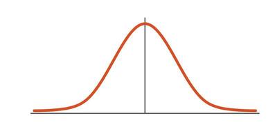
The normal distribution is a foundational concept in statistics. It is perfectly symmetric: the left and right sides of its bell-shaped curve are mirror images. This means the mean, median, and mode of a normal distribution are all equal.
But real-world data rarely follow perfect symmetry. That’s where skewness comes in.
Skewness describes asymmetry. A positive skew means a long right tail (very high values are more common than very low ones); a negative skew means a long left tail.
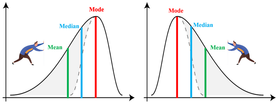
One common (sample-based) formula is
\[
\text{Skewness} = \frac{1}{n} \sum_{i=1}^n \left( \frac{x_i - \bar{x}}{s} \right)^3
\]
where \(\bar{x}\) is sample mean, \(s\) is sample standard deviations and \(n\) is number of observations.
When you don’t have access to the full dataset but know summary values like the mean, median, or mode, skewness can be approximated using
- Pearson’s First Coefficient:
\[ \text{Skewness} = \frac{\bar{x} - \text{Mode}}{s} \]
- Pearson’s Second Coefficient:
\[ \text{Skewness} = \frac{3(\bar{x} - \text{Median})}{s} \]
These are easier to compute and often agree on the direction (sign) of skew, even if the magnitude differs.
Note
How to Interpret Skewness
- Skewness = 0 → The distribution is symmetric.
- Skewness > 0 → The distribution is right-skewed (long tail on the right).
- Skewness < 0 → The distribution is left-skewed (long tail on the left).
When we compute these from a sample, we get estimates with standard er rors. As a rough rule: if an estimate is within about \(\pm 2\) standard errors of zero, there is no strong evidence of skewness or extra tail weight; if it is more than \(2\) standard errors away, that suggests positive/negative skew or heavier/lighter tails in that direction. Also, when the Pearson’s second coefficient is between -0.3 and 0.3, the distribution is approximately symmetric.
In R, example is
Kurtosis describes tail weight (and peak shape) relative to a Normal distribution. Positive kurtosis (“heavy tails”) means more extreme values and a sharper center peak; negative kurtosis (“light tails”) means fewer extremes and a flatter, broader peak.
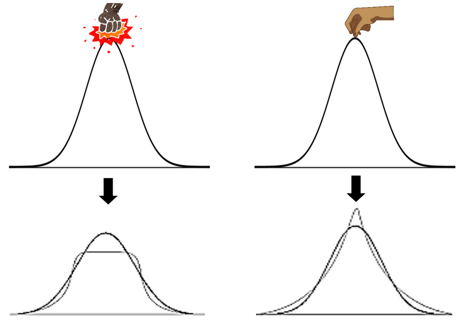
The most common formula used to calculate raw kurtosis is
\[ \text{Kurtosis} = \frac{1}{n} \sum_{i=1}^n \left( \frac{x_i - \bar{x}}{s} \right)^4 \]
A normal distribution has a kurtosis of 3. This value serves as a benchmark. To make comparisons easier, we often use a version called excess kurtosis, which is defined as:
\[ \text{Excess Kurtosis} = \text{Kurtosis} - 3 \]
This transformation re-centers the scale so that the normal distribution has excess kurtosis equal to 0.
When excess kurtosis is positive, the distribution is called leptokurtic. This means the distribution has heavier tails and a sharper peak than a normal distribution—indicating that extreme values are more likely. When excess kurtosis is negative, the distribution is referred to as platykurtic, meaning it has lighter tails and a flatter peak, with fewer extreme values than a normal distribution.
Thus, kurtosis tells us not just about the peak of the distribution, but more importantly, about how likely we are to observe values that are far from the mean.
Examples in R are
In short, skewness tells us whether a distribution is symmetric or lopsided, while kurtosis tells us whether the distribution has unusual peaks or heavy/light tails compared to a normal distribution.
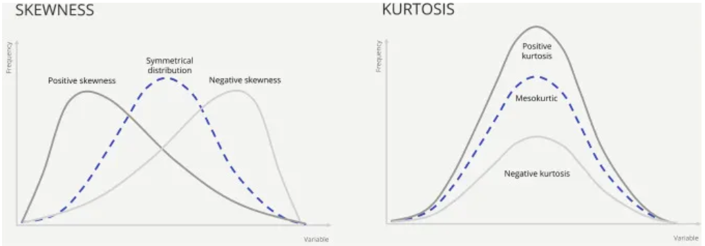
Warning
Use with care. Skewness and kurtosis are sensitive to outliers and can be unstable in small samples.
Tip: Treat them as supporting evidence, and always pair with plots (histogram/density and a QQ-plot) before drawing conclusions.
See this link for more examples in R about skewness and kurtosis.
Extremes and outliers
Extremes are simply the minimum and maximum (and other high/low quantiles). They’re expected in any sample.
Outliers are observations unusually far from the bulk relative to a rule or model (context matters).
Tukey’s rule flags an observation as a mild outlier if it lies below Q1 − 1.5×IQR or above Q3 + 1.5×IQR, and as an extreme outlier if it lies beyond Q1 − 3×IQR or Q3 + 3×IQR.
In the dataset mpg,
Compute the mean and median of
cty. Which is larger? What does that suggest about skew?For
displ(engine displacement), report SD and IQR. Which would you prefer if the distribution is skewed? Why?Find the modal category of
drv(f/r/4). Also report proportions.Compute skewness and kurtosis for
hwy,cty, anddispl. Which looks most skewed? Which has the heaviest tails?For
cty, compute min/max and identify outliers using the 1.5×IQR rule. How many outliers?
Do it yourself! :)
Multivariate Case
Cross-tabulation is the basic non-graphical way to study the relationship between two (or more) variables. For two categorical variables, make a two-way table of counts, and (depending on your question) add row % (each row sums to 100), column % (each column sums to 100), and/or cell % (table sums to 100). You can extend this to a third variable by producing one two-way table at each level of the third variable (or by using a three-way contingency table).
Associations
In EDA, we often want to ask Is one variable associated with another?
This can be for:
Two numeric variables
Two categorical variables
One numeric and one categorical
Pairs of Numeric Variables
The most common way to measure association between two numeric variables is:
Pearson’s Correlation Coefficient
Measures Strength and direction of a linear relationship.
Values range from \(-1\) to \(+1\):
\(+1\): Perfect positive linear association
\(-1\): Perfect negative linear association
\(0\): no linear relationship
Important
Person’s \(r\) only measures linear relationships.
Caution
If the relationship is curved, \(r\) can be misleading. See Anscombe’s Quartet for famous examples.
This figure is Anscombe’s quartet—four tiny datasets that share (nearly) the same summary statistics (means of \(x\) and \(y\), variances, Pearson correlation) but look very different once you plot them.
Dataset I (top-left): A textbook linear relationship with ordinary scatter around the line. Here a linear model is sensible.
Dataset II (top-right): A clear curved (non-linear) pattern. The fitted straight line and the correlation suggest “strong linearity,” but that’s misleading—a linear model is inappropriate.
Dataset III (bottom-left): Almost perfectly linear except for one outlier in \(y\). That single point inflates the correlation and affects the fit; without it the pattern is very regular.
Dataset IV (bottom-right): Most \(x\) values are the same (a vertical stack); a single high-leverage point at large \(x\) drags the regression line to create a high correlation/“good” fit. The model is being driven by one point.
Tip
Numbers alone can fool you. Correlation, means, and regression coefficients can look “good” even when the relationship is non-linear or dominated by outliers/high-leverage points. Always plot your data, and follow up with diagnostics (residual plots, leverage/Cook’s distance) before trusting a model.
The population correlation (\(\rho\)) is defined as
\[ \rho = \frac{Cov(X, Y)}{\sqrt{\sigma_X \sigma_Y}} =\frac{E[(X - \mu_X)(Y - \mu_Y)]}{\sqrt{E[(X - \mu_X)^2E[(Y - \mu_Y)^2}} \]
where \(\mu_X\) and \(\mu_Y\) are the population means, \(\sigma_X\) and \(\sigma_Y\) are the population standard deviations.
In practical, we do not know \(\mu\) or \(\sigma\) , so we replace them with their sample counterparts and compute the Pearson’s \(r\) (sample) as
\[ r=\frac{\sum_{i=1}^n(x_i-\bar{x})(y_i-\bar{y})}{\sqrt{\sum_{i=1}^n (x_i-\bar{x})^2}\sqrt{\sum_{i=1}^n (y_i-\bar{y})^2}} \]
Rank Correlations: For Non-linear Relationships
If the relationship is not linear, use a rank correlation:
| Method | Notes |
|---|---|
| Spearman’s \(\rho\) | More sensitive to outliers |
| Kendall’s \(\tau\) | Better for ordinal data |
These methods:
convert data into ranks (1st, 2nd, 3rd, …)
Measure how well the ranks agree between two variables
They are interpreted like Pearson’s \(r\):
Close to \(\pm 1\) means strong association
\(0\) means no association
Pairs of Categorical Variables
For two categorical variables, we ask Are certain combinations of categories more or less common than expected?
The most basic tool is the contingency table. It counts how many times each combination of categories appears in the data.
This table helps us to answer questions like:
Do some combinations occur more often than others?
Are the two categorical variables associated?
Example: Penguins Species and Islands
Imagine we observed \(344\) penguins from three species on three islands. We record how many penguins of each species were found on each island.
| Species | Biscoe | Dream | Torgersen | Total |
|---|---|---|---|---|
| Adelie | 44 | 56 | 52 | 152 |
| Chinstrap | 0 | 68 | 0 | 68 |
| Gentoo | 124 | 0 | 0 | 124 |
| Total | 168 | 124 | 52 | 344 |
Summary of Correlation and Association Measures in R
This table shows which association or correlation measure to use depending on the types of variables.
| Nominal | Ordinal | Numeric | |
|---|---|---|---|
| Nominal | Cramér’s V φ coefficient (binary) Tetrachoric corr. (binary) |
No standard measure | Eta (η) |
| Ordinal | No standard measure | Spearman’s ρ Kendall’s τ |
Spearman’s ρ Kendall’s τ |
| Numeric | Eta (η) | Spearman’s ρ Kendall’s τ |
Pearson’s r Spearman’s ρ Kendall’s τ |
In this table, we can find the R function for the methods described above with a brief description of its interpretation.
| Measure | Interpretation | R Function / Package |
|---|---|---|
| Pearson’s r | Strength of linear relationship | cor(x, y, method = "pearson") |
| Spearman’s ρ | Strength of monotonic relationship | cor(x, y, method = "spearman") |
| Kendall’s τ | Rank-based measure; robust to ties | cor(x, y, method = "kendall") |
| Spearman’s ρ or Kendall’s τ | Association between ranks | Same as above |
| Phi (φ) coefficient | Association between two binary variables | psych::phi(table) |
| Cramér’s V | Strength of association in contingency table | rcompanion::cramerV(table) or DescTools::CramerV(table) |
| Eta (η) coefficient | How much variance in numeric var is explained by group | DescTools::EtaSq(aov(y ~ group)) |
| Tetrachoric correlation | For binary variables assumed to reflect latent continuous variables | psych::tetrachoric(table)$rho |
| Ordinal vs. Nominal | Use visual summaries or grouped statistics | table(), ggplot2::geom_bar(), mosaicplot() |
Notes
- Spearman’s ρ and Kendall’s τ both work well for ranked data and are more robust to non-linear trends than Pearson’s r.
- Cramér’s V is used for nominal data, and its values range from 0 to 1.
- Eta squared (η²) measures how much of the variance in the numeric variable is explained by the group (nominal) variable.
- For ordinal + nominal, no widely accepted coefficient exists; focus on visual summaries (e.g., bar charts or stacked plots).
Example: What Should You Use?
| Situation | Use |
|---|---|
| Height vs Weight | Pearson’s r |
| Exam Rank vs Satisfaction Level | Kendall’s τ |
| Eye Color vs Blood Type | Cramér’s V |
| Gender vs Income | Eta |
| Plant Type vs Size Category | Cross-tab |
These summaries help us compare groups and form initial impressions (for example, the mean suggests a “typical” value). But a few numbers can not tell the whole story—different datasets can share the same mean and spread yet look very different, so always pair numbers with plots and context.
In the dataset mtcars,
Compute the Pearson correlation between
mpg(miles per gallon) andhp(horsepower).Compute the Spearman correlation between the same two variables.
Now, answer these questions:
Is the relationship positive or negative?
Do Pearson’s r and Spearman’s \(\rho\) give similar results? Why or why not?
Do it yourself! :)
In the dataset Titanic,
Create a contingency table of passenger
ClassvsSurvived.Compute appropriate bivariate association for this association
Now, answer this question:
- How strong is the association according to the used coefficient?
Do it yourself! :)
In the dataset palmerpenguins::penguins,
Compute the correlation between
bill_length_mmandbill_depth_mm.Build a contingency table of
speciesandislandand compute Cramér’s V.
Do it yourself! :)
In the dataset iris,
Compute the appropriate coefficient of bi-variate association between Sepal.Length and Species.
Do it yourself! :)
Comprehensive Exercise: Exploring the airquality Dataset
The dataset airquality (built into R) contains daily air quality measurements in New York, May–September 1973.
Variables include:
Ozone(ppb),Solar.R(solar radiation),Wind(mph),Temp(°F),Month(5 = May, …, 9 = September),Day(day of month).
- Inspect the dataset: How many rows and columns does it have? Are there missing values?
- Compute the mean, median, and standard deviation of
Ozone,Wind, andTemp.
- For
Month, create a frequency table. Which month has the most observations?
- Compute the Pearson correlation between
OzoneandTemp.
- Compute the Spearman correlation between
OzoneandSolar.R.
- Compute the correlation between
OzoneandMonth
- Which factor (Temp, Wind, Solar.R, or Month) seems most strongly associated with Ozone levels?
2.4.2.2 Graphical Summaries
Graphs help us see patterns, spot outliers, and understand distributions.
Common EDA plots include: - Histograms – show the shape and spread of a numeric variable - Boxplots – show center, spread, and outliers - Bar charts – show frequencies of categories - Scatterplots – show relationships between two numeric variables
Graphs are easier to understand than tables of numbers. They help us and others see what’s going on in the data.
2.4.2.2.1 Principles of Analytic Graphics
Based on (Tufte 2006), there are six key principles for designing informative and effective graphs.
Principle 1 – Show Comparison
Good data analysis always involves comparing things. A single number or result doesn’t mean much on its own. We need to ask:
For example, if we see that children with air cleaners had more symptom-free days, that sounds good. But how do we know the air cleaner made the difference? We only know that by comparing to another group of children who didn’t get the air cleaner. When we add that comparison, we can see that the control group didn’t improve — so the improvement likely came from the air cleaner.
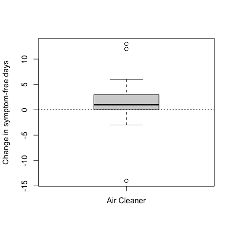
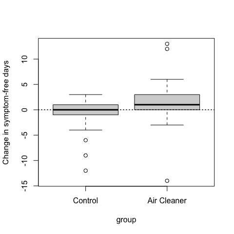
Good data graphics should always show at least two things so we can compare and understand what’s really happening.
Principle 2: Show Causality and Explanation
When making a data graphics, it is helpful to show why you think something is happening – not just what is happening. Even if you can not prove a cause, you can show your hypothesis of idea about how one thing might lead to another.
For example, in #figEDA2 we saw that children with an air cleaner had more symptom–free days. But that alone does not explain why. A good follow-up question is: “Why did the air cleaner help?“ One possible reason is that air cleaners reduce fine particles in the air – especially in homes with smokers. Breathing in these particles can make asthma worse, so removing them might help children feel better. To show this, we can make a new plot.
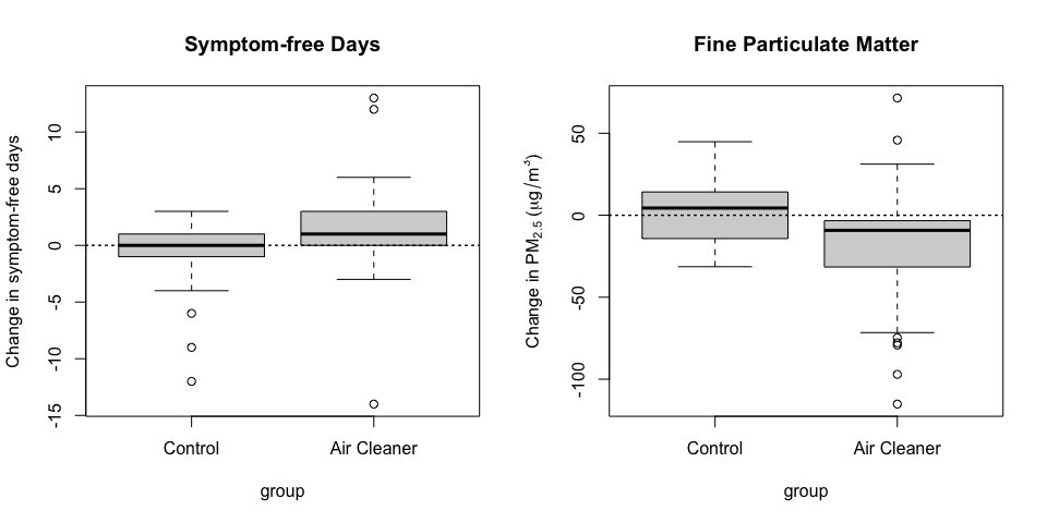
From the plot, we can see:
Children with air cleaners had more symptom-free days.
Their homes also had less PM2.5 after six months.
In contrast, the control group had little improvement.
This pattern supports the idea that air cleaners work by reducing harmful particles — but it is not final proof. Other things might also cause the change, so more data and careful studies are needed to confirm.
Principle 3: Show Multivariate Data
In real life, most problems involve more than one or two variables. We call this multivariate data. Good data graphics should try to show these multiple variables at the same time, instead of reducing everything to just one number or a simple trend.
Let us look at an example.
The mtcars dataset contains information about 32 car models from the 1970s. Each row is a car and each column is a variable. Some of these variables are: mpg: miles per gallon (fuel efficiency), wt: weight (in 1000 lbs), cyl: number of cylanders (engine size), hp: horse power, qsec: 1/4 mile time (acceleration), am: Transmission (0 = auto, 1 = manual). These variables help us to explore relationship between engin size, weight, fuel use, and more.
We want to know how a car’s weight affects its fuel efficiency (miles per gallon). We look at a simple scatter plot of these two variables.
Heavier cars tend to have lower fuel efficiency. But is weight the only thing affecting fuel use?
Cars also have different engine sizes, measured by cylinders (cyl). This affects both weight and fuel efficiency. To understand the relationship better, we add cyl as a third variable by coloring points by the number of cylinders.
Now, we see that cars with 4, 6, and 8 cylinders have different trends. The overall pattern changes once we include this third variable.
Caution
The number of cylinders cofounds the relationship – it influences both weight and MPG.
To understand how the number of cylinders changes the relationship between weight and fuel efficiency, we can make separate plots for each cylinder group. This is called faceting.
Important
Sometimes, looking at groups separately helps us find clearer patterns that get lost in a big mixed dataset.
Even, we can add the variable transmission(am) as an additional variable by using shapes or facet.
Now, each panel shows either automatic automatic or manual cars. Within each panel, colors show the number of cylinders.
Even we can use facet_grid that allows us to split the plot into rows and columns based on two categorical variables – perfect for showing how relationships vary across combinations. We will use am in rows and cyl in columns.
This way, we can see how the relationship between weight and MPG changes in each group combination.
Principle 4: Integrate Evidence — Keep the message clear
When you make a graph, do not rely on points and lines to show your idea. You can also use: Numbers to give exact values, Words or short labels to explain what is happening, Pictures or diagrams to give context.
Important
A good graph tells a complete story.
Use all tools you need – not just the ones your software gives you easily.
Important
The goal is not to just make a nice picture, but to help people understand your message clearly.
Principle 5: Describe and Document the Evidence
A good graph tells a story – clearly and completely. That means it should include:
A clear title
Labels for the x-axis and y-axis
Units for measurement (e.g. ‘weights in 1000 lbs’)
Time scale if needed (e.g. ‘daily’, ‘monthly’)
where the data comes from (e.g., ‘New York’, ‘EPA’)
source of the data
Tip
Imagine someone looking only at your plot without reading anything else. Can they understand the main idea? if yes – your plot is doing a good job.
Note
Even if your graph is not final, it is a good habit to label things early. It helps you and others understand what is going on.
For example, instead of using
try this
when we use ggplot2, it is better to add labs() like we did until now.
Principle 6: Content is King
Important
A beautiful plot means nothing if the question is weak or the data is poor.
Data graphics are only powerful when:
the question is clear and important
the data is high quality and relevant
the evidence supports the question
No chart or fancy design can fix a bad question or messy data. That is why it is crucial to start with a strong idea and only show what really matters to answer that idea.
Tip
Do not just decorate your data – focus on the message!
2.5 Airquailty dataset
We will explore the airquality dataset, which contains daily measurement of air pollutants and weather conditions in New York City May to September 1973.
Step 1 – How do ozone levels vary across different months in New York during the summer in 1973?
This question is specific and focused: One location (New York), One variable (ozone), one year and a defined time window (May to September)
Step 2 – The airquality dataset is built into R. Load it with:
Step 3 – Check the size and dimension of the dataset
Step 4 – run str()
Caution
There are some missing values (NA , Not Available) in the dataset.
Step 5 –
Step 6 –
First, we count how many rows (i.e., records or observations) are in the dataset.
Missing values (denoted as NA in R) can lead to incorrect calculations or unexpected results. It is good practice to check how many missing values there are per variable.
Using `dplyr`
This command uses across() to apply the same function to all columns, and sum(is.na(.)) to count the number of missing values per column.
Tip
What is ~ ?
The ~ introduces an anonymous function — a function written inline without a name.
This
~ sum(is.na(.))~sum(is.na(.))is a shorthand for
function(x) sum(is.na(x))function (x)
sum(is.na(x))Or, we can check how many rows are from July:
check how many missing values are just in August.
Step 7 – According to the U.S. EPA, ozone levels above 70 parts per billion (ppb) may be considered unhealthy.
Based on the output, many days have safe levels and some days have extremely high ozone levels.
Step 8 – Let us check the average ozone level by month:
This gives a quick overview of how ozone levels change over the summer. Let visualize it:
Based on the plot, we observe that July and August have the highest median ozone levels, showing that typical ozone concentrations were significantly higher during mid-summer. This suggests a seasonal pattern, likely driven by higher temperatures and increased sunlight, which promote the formation of ozone. The taller boxes and whiskers for these months reflect a greater variability in ozone levels, including several high outliers. In contrast, May and September show lower median values and less variation, possibly due to cooler temperatures and different atmospheric conditions. The median ozone level is June is slightly higher than in May but lower than in July, with a moderate level of variability. Overall, this seasonal trend is consistent with environmental science – ozone forms more easily in strong sunlight and warm conditions, which are more prevalent in July and August.
Step 9 – Let us examine whether temperature or wind speed might help explain ozone patterns.
You may observe that there is a positive relationship between temperature and ozone and a negative relationship between wind speed and ozone. These patterns support common environmental science findings.
Step 10 – Based on our findings, we might fit a simple regression model
We might also refine our question: On which days was the ozone level unusually high, and what were the weather conditions on those days?
Alternative question
Step 1 – Which weather factor—temperature, wind, or solar radiation—has the strongest relationship with ozone levels during the summer of 1973 in New York?
This question is more analytical than descriptive, and focused on relationships between variables. So, we need to examine how ozone changes with respect to other variables.
Step 2 –
Step 3 –
Step 4 –
Step 5 –
Step 6 –
Step 7 –
Check how often ozone exceeds EPA’s 70 ppb guideline:
Step 8 –
Since dplyr does not include a cor() function, we will compute correlations manually using summarise() and cor() from base R, keeping within tidy pipelines:
More advanced:
But sometimes, a simple code gives the more informative output:
visualize the relationships:
Step 9 –
When we check p-values and coefficients, we see Temp has strong and significant positive effect, Wind has strong and significant negative effect, and Solar.R has weaker effect but still contributes.
Step 10 –
Now we know temperature has the strongest effect on ozone levels:
Should we check for nonlinear effects (e.g., does ozone spike at high temps)?
Would a time-based model (e.g. by day or month) add insight?
What is the temperature threshold where ozone exceeds 70 ppb?
Are there interactions between variables (e.g. high temp + low wind)?
Do results change if the we include time (e.g. month)?
We might now refine our question: How much does temperature need to rise before ozone levels exceed the 70 ppb threshold?
As Tukey emphasized, EDA is about “detecting the unexpected” and learning from the data before attempting to explain it.
Tip
At the beginning, it is hard to ask the perfect question because you do not know the date well yet. But here is the secret:
Each time you explore one idea, it leads to a new question. That is how you:
Discover patterns
Notice surprises
Understand your data more deeply
Caution
Good EDA is like this
Ask a question
Make a plot or summary
Look at the result
Ask a new, better question
Repeat!
Tip
Do not wait for the perfect question - just start. Exploration will lead you to insight.